
Female flight attendant - All Nippon Airways Uniform
1966 ~ 1970
Top
Bottom
Accessory
Overall
Description
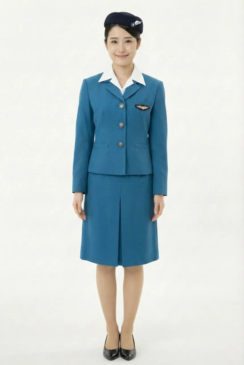
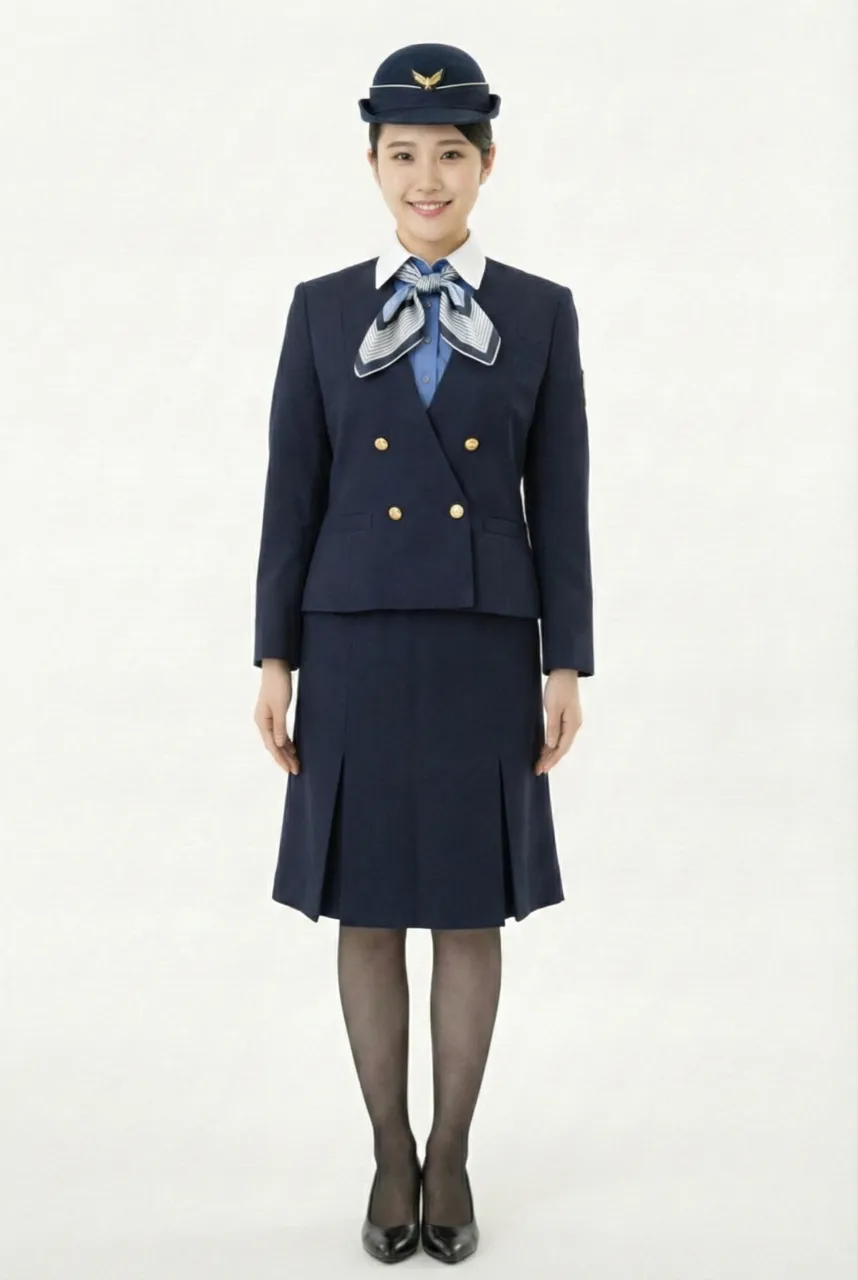
This uniform represents the third-generation uniform series, introduced during the period when the aviation industry entered the jet age and the global aviation boom rapidly expanded. It symbolized a significant image upgrade undertaken by the airline in response to the arrival of the high-speed air travel era. The most distinctive feature of this series was the formal establishment of bright blue as the core visual theme, giving the uniform a high level of recognizability while also marking an important milestone in the development of the airline’s corporate brand identity.
The overall design is based on a standard suit-style uniform structure, featuring a fitted tailored jacket paired with a knee-length skirt in a classic combination. The silhouette is neat and well-proportioned, reflecting the professionalism and discipline commonly emphasized in airline uniforms of that era. The jacket uses a row of gold buttons as the central visual axis, complemented by natural shoulder lines and a gently cinched waist, creating a composed yet elegant image that balances professional service with refined femininity. The skirt length is set at the knee, maintaining a dignified appearance while also meeting the practical functional needs of cabin service.
The hat design adopts a matching angled pillbox-style cap in the same color tone, paired with a simple emblem, reinforcing the unified visual language and the symbolic identity of aviation professionalism. The consistency between the hat and the suit color allows cabin crew to present a highly coordinated and orderly brand image as a team, while also continuing the early tradition of airline uniforms that emphasized posture, discipline, and formal presentation.
From a design concept perspective, the series was created by Nobuo Nakamura, based on the core idea of “the boundless expanse of the sky.” This concept was expressed through the incorporation of bright blue into the uniform design. The blue symbolizes the vast sky, the freedom of flight, and the future potential of aviation development, directly echoing the sense of speed and internationalization brought about by the jet age. Compared with earlier uniforms that tended to be darker and more conservative, this design appeared noticeably brighter and more progressive in its color expression.
In terms of color language, the bright blue not only represented the symbolic imagery of the sky and flight but was also gradually established as the airline’s representative corporate color. This shade of blue was later extended to aircraft livery applications, eventually becoming a long-term signature color of the brand. Through the unification of uniform and aircraft color schemes, the airline successfully established a clear and internationally recognizable corporate visual identity.
Uniform List
-
Female flight attendant
1955 ~ 1958 -
Female flight attendant
1958 ~ 1966 -
Female flight attendant
1966 ~ 1970 -
Female flight attendant
1970 ~ 1974 -
Female flight attendant
1974 ~ 1979 -
Female flight attendant
1979 ~ 1982 -
Female flight attendant
1982 ~ 1990 -
Female flight attendant
1990 ~ 2005 -
Female flight attendant
2005 ~ 2015 -
Female flight attendant
2015 ~ -
Female flight attendant
2015 ~
The images displayed in this section are AI-generated illustrations and are not official materials from the original organizations or brands. They do not represent actual uniform designs, real-life wear, or official positions. The content is for informational and organizational purposes. All brand/organization names and logos mentioned are the property of their respective owners.