
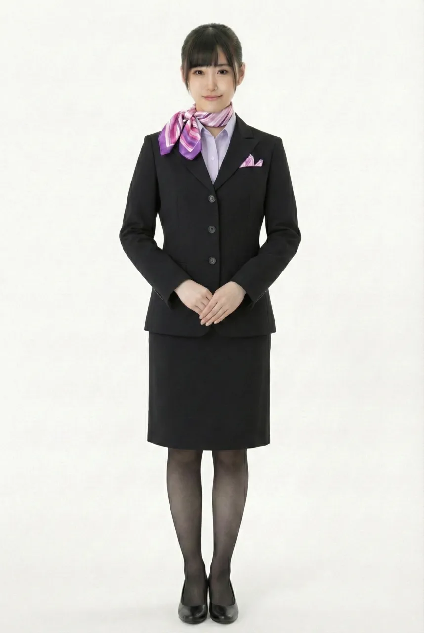
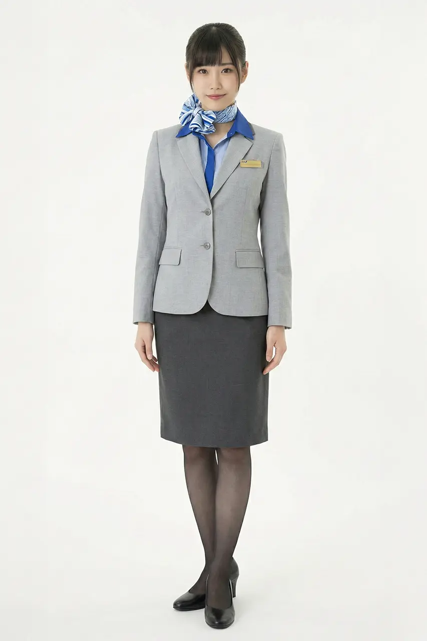
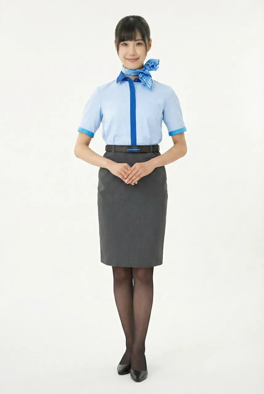
Female flight attendant - All Nippon Airways Uniform
1979 ~ 1982
Top
Bottom
Accessory
Overall
Description
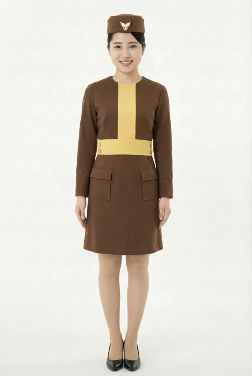
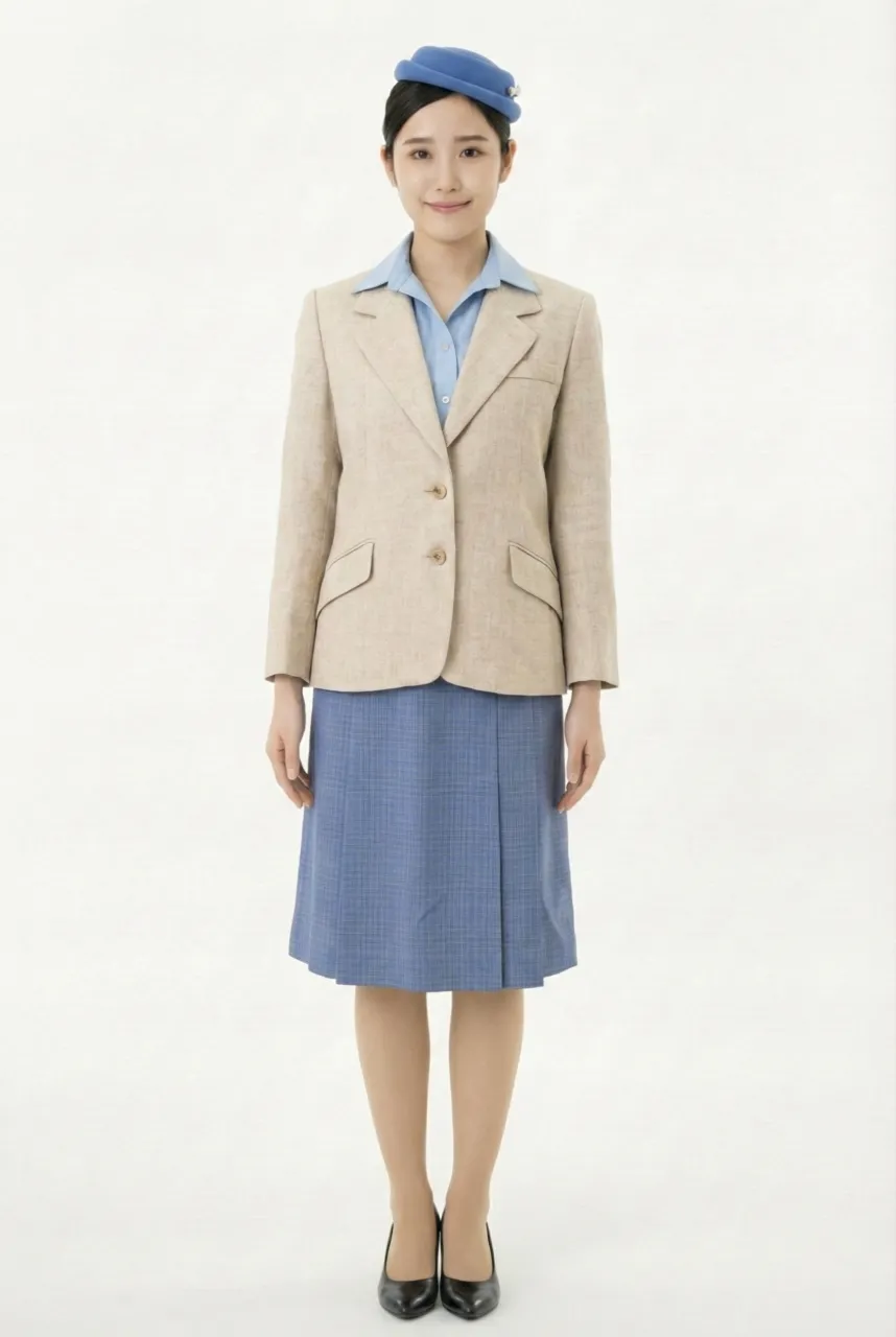
This uniform was fully redesigned to coincide with the introduction of the “Super Jumbo” — namely the Boeing 747SR — and represents a significant shift in the airline’s brand image as it entered the era of large-capacity wide-body operations. As passenger volume increased and service philosophy evolved toward greater accessibility and friendliness, the uniform design likewise transitioned from a more formal, authority-oriented style to a softer and more modern visual language. This shift reflected the emerging positioning of air travel in the Super Jumbo era as more comfortable, approachable, and passenger-centric.
The overall silhouette is built around a beige tailored jacket paired with a blue skirt, creating a noticeably lighter and more welcoming impression compared to the traditional dark-toned airline suits of earlier periods. The jacket features a single-breasted structure with clean, natural tailoring lines, resulting in a streamlined and fashion-oriented proportion that reduces the quasi-military rigidity often associated with classic airline uniforms. The blue knee-length skirt balances the light-toned upper garment with a calm and refined color contrast, preserving a sense of professionalism while enhancing the overall warmth and approachability of the cabin crew image.
Designed by Issey Miyake, this uniform series is particularly notable for its conceptual approach of a “uniform that does not look like a uniform.” Rather than emphasizing strict formality and standardization, the design adopts softer tailoring language and gentle color harmonies, presenting cabin crew as more human, elegant, and service-oriented figures aligned with contemporary hospitality values. Within the historical development of airline uniforms, this philosophy was considered highly progressive and innovative, as it deliberately redefined the visual role of uniforms in commercial aviation.
Accessory design further reinforces the clean and modern aesthetic. A light blue pillbox-style hat with a minimal emblem replaces the more ceremonial and rigid headwear traditionally seen in airline uniforms, reducing formality while maintaining visual cohesion. The light blue blouse worn underneath echoes the skirt and hat tones, establishing a consistent and orderly color linkage that conveys cleanliness, unity, and refinement—hallmarks long associated with Japanese airline uniform design.
From a color strategy perspective, beige symbolizes warmth, softness, and inclusiveness, while blue continues the aviation industry’s long-standing association with safety, reliability, and trust. Compared to earlier uniforms dominated by darker navy palettes, this lighter combination projects greater friendliness and modernity. Overall, the design clearly embodies the airline’s intention during the Super Jumbo era to cultivate a more open, internationally approachable, and passenger-friendly brand image while still maintaining professionalism and visual discipline.
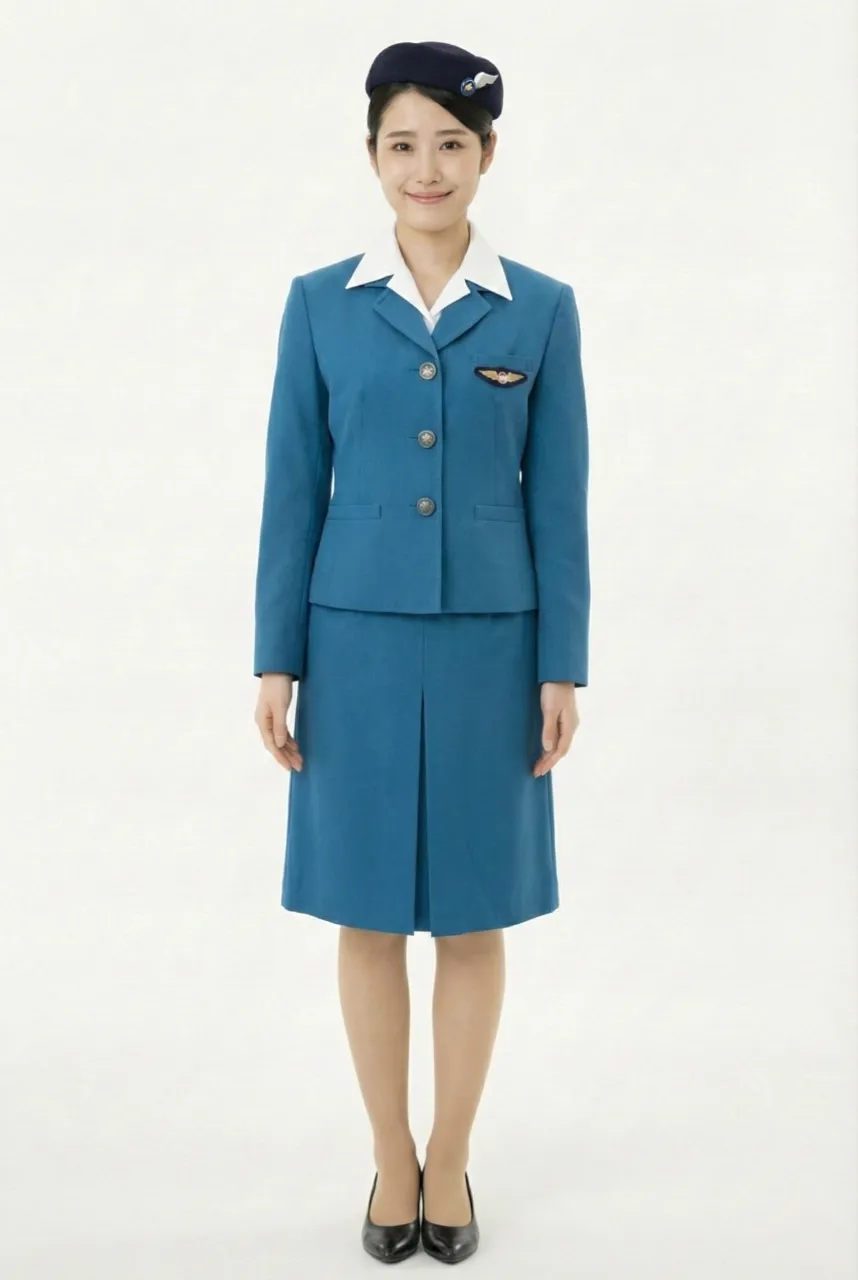
Uniform List
-
Female flight attendant
1955 ~ 1958 -
Female flight attendant
1958 ~ 1966 -
Female flight attendant
1966 ~ 1970 -
Female flight attendant
1970 ~ 1974 -
Female flight attendant
1974 ~ 1979 -
Female flight attendant
1979 ~ 1982 -
Female flight attendant
1982 ~ 1990 -
Female flight attendant
1990 ~ 2005 -
Female flight attendant
2005 ~ 2015 -
Female flight attendant
2015 ~ -
Female flight attendant
2015 ~
The images displayed in this section are AI-generated illustrations and are not official materials from the original organizations or brands. They do not represent actual uniform designs, real-life wear, or official positions. The content is for informational and organizational purposes. All brand/organization names and logos mentioned are the property of their respective owners.