
Female flight attendant - All Nippon Airways Uniform
1974 ~ 1979
Top
Bottom
Accessory
Overall
Description
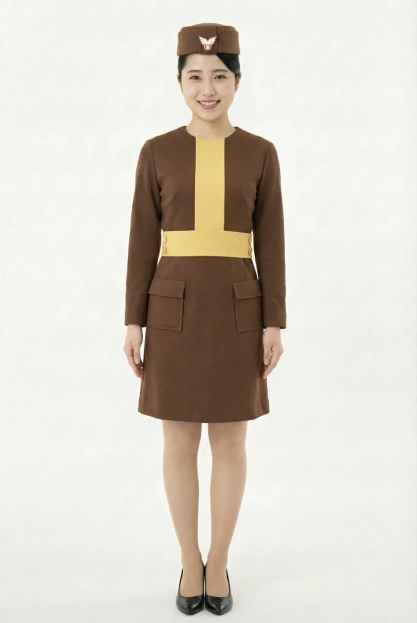
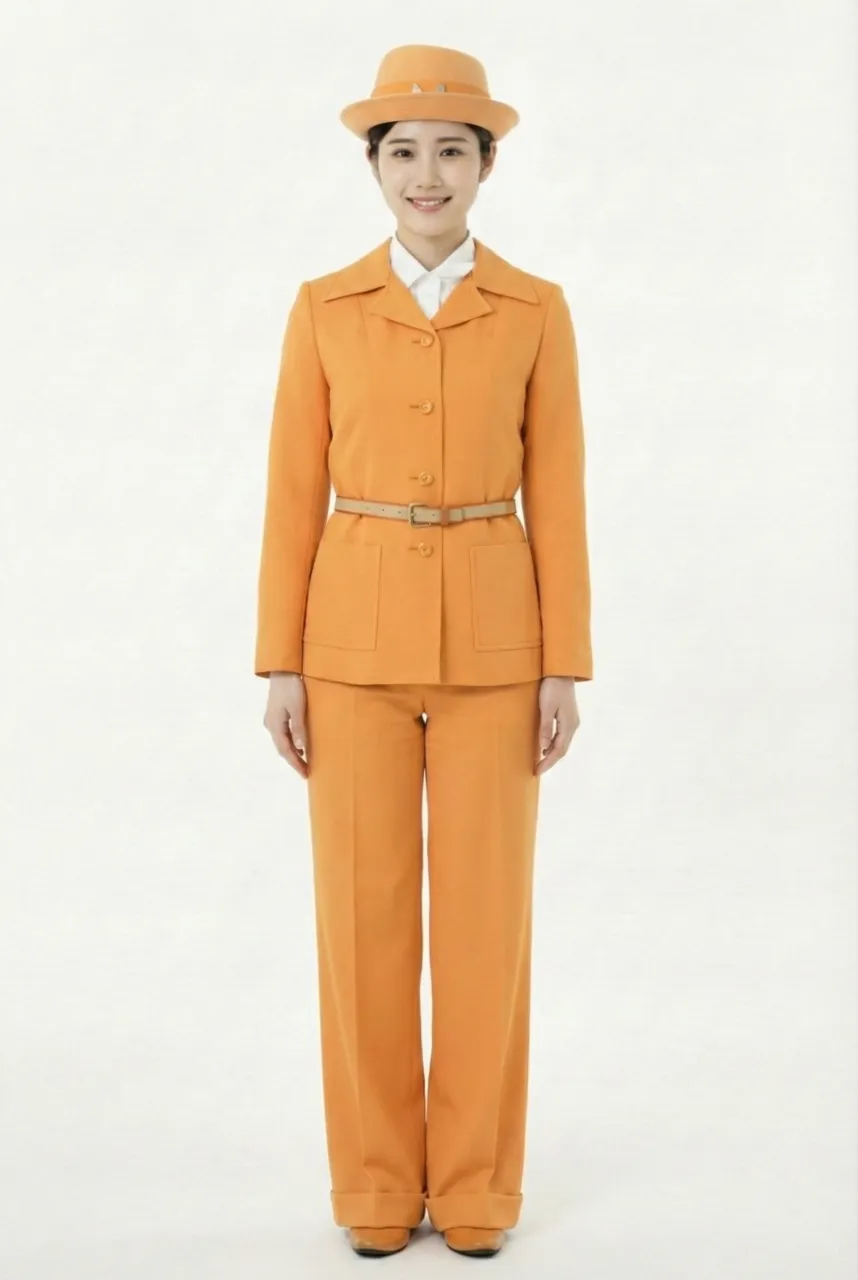
This uniform belongs to the fifth-generation uniform series adopted in 1974, commonly referred to as the “TriStar Look” (トライスタールック) due to its association with the introduction of the Lockheed L-1011 TriStar aircraft at the time. It symbolized a significant step in the airline’s modernization during the jet age and represented an important visual renewal of the corporate image. Naming the uniform concept after the aircraft itself was highly emblematic in the history of airline uniforms and reflected a comprehensive visual strategy in which brand identity evolved in tandem with the new-generation fleet.
The overall design is centered on a vivid orange suit as its core structure, featuring a tailored jacket paired with trousers (flared pants / pantaloons), showcasing a highly fashion-forward design language characteristic of the 1970s. The jacket adopts a single-breasted design with clean tailoring and elongated proportions, while a belt cinches the waist to enhance structural definition. The wide-leg trousers create a smooth vertical silhouette, giving the overall look both modernity and functionality. Compared to previous generations of flight attendant uniforms that were primarily skirt-based, this series boldly adopted trousers, which became a major talking point at the time and remains the only generation in the airline’s uniform history to fully embrace a pants-based style.
From a design perspective, the series was created by Tatsuya Ito (伊藤達也), who emphasized the fusion of airline uniforms with contemporary fashion trends, breaking away from the previously conservative and standardized uniform framework. Through high-visibility color schemes and minimalist tailoring, the uniform aligned more closely with the visual style of international professional fashion in the 1970s, presenting a corporate image that was confident, progressive, and forward-looking. This approach—integrating the era of the aircraft with the language of fashion design—made the “TriStar Look” one of the most iconic visual symbols in the brand’s history.
The accessories followed a highly unified styling strategy. A pillbox hat in matching orange, paired with a simple emblem, reinforced overall consistency and recognizability. A white shirt worn underneath functioned as a visual balancing element, creating clear layering against the high-saturation orange while maintaining a neat and professional appearance. The belt detail further enhanced the completeness of the silhouette and the proportional balance of the outfit.
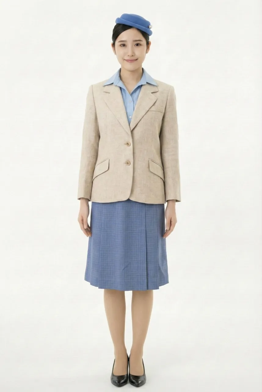
In terms of color language, the series included three variations—blue, beige, and orange—forming a comprehensive uniform system, with the orange version being the most symbolic and visually striking. During the 1970s, orange was often associated with vitality, innovation, and futuristic technology, echoing the rapid growth of the aviation industry and the introduction of new wide-body aircraft. Overall, the “TriStar Look,” characterized by its tricolor variations and the adoption of flared trousers, not only generated significant attention but also marked a major milestone in the evolution of airline uniforms—from traditional formality toward fashion-oriented, aircraft-era-inspired, and highly brand-identifiable design.
The overall design is centered on a vivid orange suit as its core structure, featuring a tailored jacket paired with trousers (flared pants / pantaloons), showcasing a highly fashion-forward design language characteristic of the 1970s. The jacket adopts a single-breasted design with clean tailoring and elongated proportions, while a belt cinches the waist to enhance structural definition. The wide-leg trousers create a smooth vertical silhouette, giving the overall look both modernity and functionality. Compared to previous generations of flight attendant uniforms that were primarily skirt-based, this series boldly adopted trousers, which became a major talking point at the time and remains the only generation in the airline’s uniform history to fully embrace a pants-based style.
From a design perspective, the series was created by Tatsuya Ito (伊藤達也), who emphasized the fusion of airline uniforms with contemporary fashion trends, breaking away from the previously conservative and standardized uniform framework. Through high-visibility color schemes and minimalist tailoring, the uniform aligned more closely with the visual style of international professional fashion in the 1970s, presenting a corporate image that was confident, progressive, and forward-looking. This approach—integrating the era of the aircraft with the language of fashion design—made the “TriStar Look” one of the most iconic visual symbols in the brand’s history.
The accessories followed a highly unified styling strategy. A pillbox hat in matching orange, paired with a simple emblem, reinforced overall consistency and recognizability. A white shirt worn underneath functioned as a visual balancing element, creating clear layering against the high-saturation orange while maintaining a neat and professional appearance. The belt detail further enhanced the completeness of the silhouette and the proportional balance of the outfit.
In terms of color language, the series included three variations—blue, beige, and orange—forming a comprehensive uniform system, with the orange version being the most symbolic and visually striking. During the 1970s, orange was often associated with vitality, innovation, and futuristic technology, echoing the rapid growth of the aviation industry and the introduction of new wide-body aircraft. Overall, the “TriStar Look,” characterized by its tricolor variations and the adoption of flared trousers, not only generated significant attention but also marked a major milestone in the evolution of airline uniforms—from traditional formality toward fashion-oriented, aircraft-era-inspired, and highly brand-identifiable design.
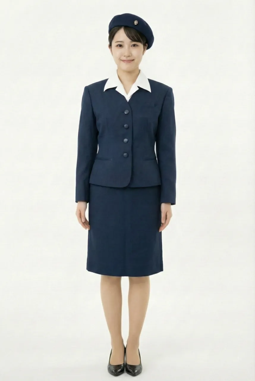
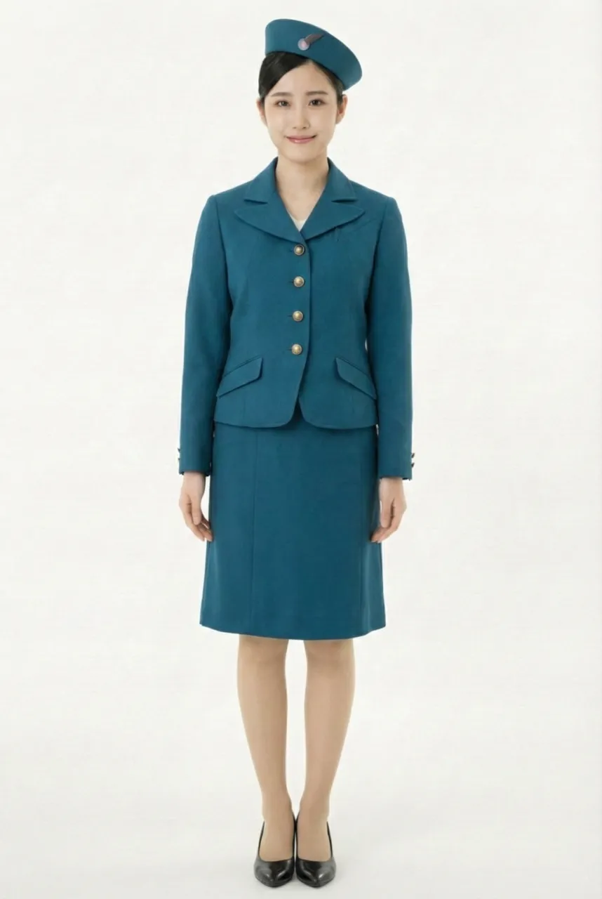
Uniform List
-
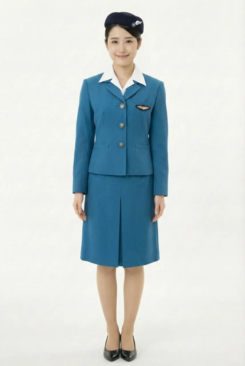
Female flight attendant
1955 ~ 1958 -
Female flight attendant
1958 ~ 1966 -
Female flight attendant
1966 ~ 1970 -
Female flight attendant
1970 ~ 1974 -
Female flight attendant
1974 ~ 1979 -
Female flight attendant
1979 ~ 1982 -
Female flight attendant
1982 ~ 1990 -
Female flight attendant
1990 ~ 2005 -
Female flight attendant
2005 ~ 2015 -
Female flight attendant
2015 ~ -
Female flight attendant
2015 ~
The images displayed in this section are AI-generated illustrations and are not official materials from the original organizations or brands. They do not represent actual uniform designs, real-life wear, or official positions. The content is for informational and organizational purposes. All brand/organization names and logos mentioned are the property of their respective owners.