
Female flight attendant - All Nippon Airways Uniform
1970 ~ 1974
Top
Bottom
Accessory
Overall
Description
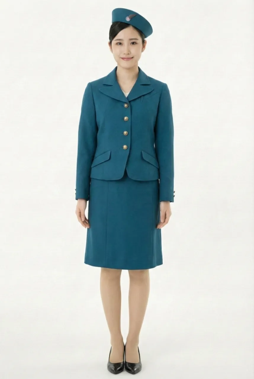
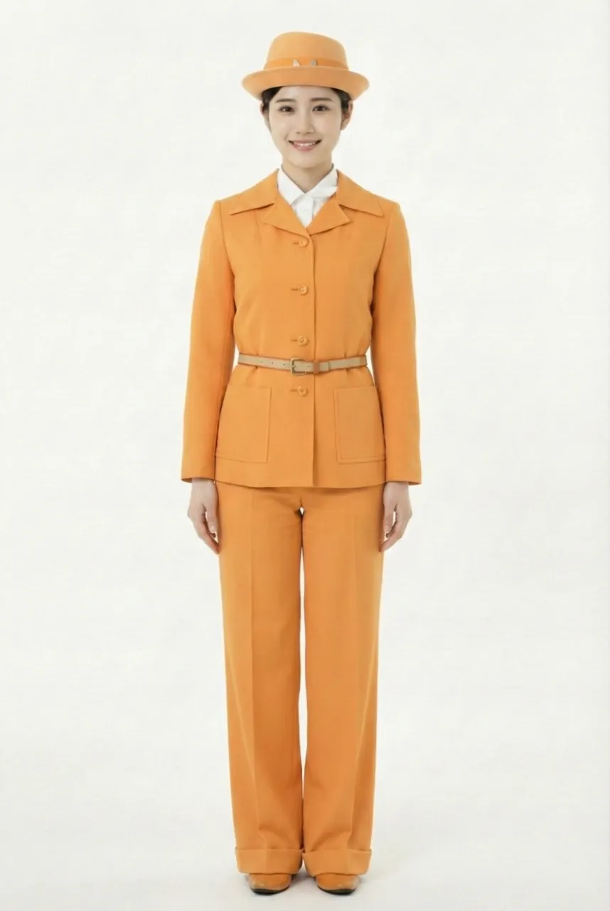
This uniform represents the fourth-generation uniform series, introduced in 1970 as part of a comprehensive image renewal aligned with the Osaka World Expo (Expo ’70). It symbolized a major transformation in the airline’s brand image at a time when its international exposure was rapidly increasing. The most significant breakthrough of this series was the formal introduction of the one-piece dress as the core flight attendant uniform, marking a shift away from traditional suit-based uniforms toward a more contemporary and fashion-oriented design language. This transition reflects the early 1970s trend in which the aviation industry increasingly intersected with popular culture and modern fashion.
The overall design focuses on an A-line mini dress silhouette, adopting the then highly fashionable A-line shape and shorter skirt length to create a light, youthful, and futuristic visual impression. The one-piece dress features a clean and streamlined structure with minimal ornamentation, relying instead on precise tailoring proportions and color-block arrangements to establish strong visual identity. Compared with the more conservative uniforms of earlier periods, the mini A-line cut was considered highly avant-garde and attention-grabbing at the time.
From a design perspective, the series was created by Jun Ashida, who introduced haute couture design thinking into airline uniforms. As a result, the uniform was no longer treated merely as functional workwear but as an important medium for expressing corporate image and the aesthetics of the era. The design combines minimalist silhouettes with bold color contrasts, emphasizing modernity and international appeal, and resonating with the Expo ’70 atmosphere of “future, technology, and global exchange,” thereby presenting cabin crew as more dynamic, approachable, and forward-looking.
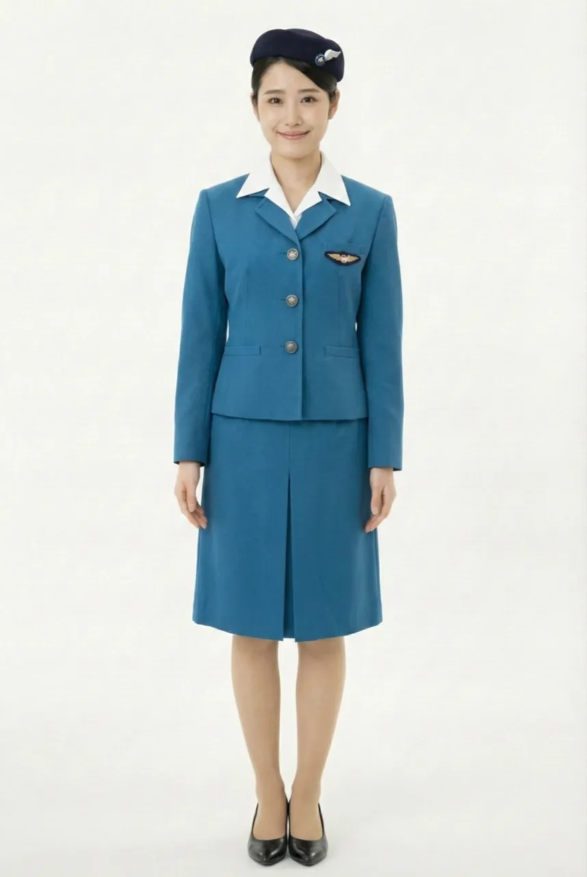
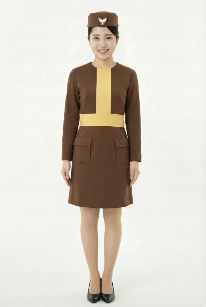
In terms of color language, the series adopted different color systems according to the season. The summer uniform featured refreshing blue and white tones, conveying a bright, clean, and service-friendly image. The winter uniform, by contrast, used a combination of yellow and brown dresses, in which a brown base was accented by a yellow central line and matching belt, creating a striking vertical visual focal point with high recognizability. Yellow symbolized vitality and futurism, while brown conveyed warmth and stability; their combination was both fashionable and effective for corporate identification at the time.
The accessory design continued the unified visual language of the series. The hat adopted a simple pillbox-style form paired with a wing badge, reinforcing the symbolism of aviation professionalism and brand identity. A contrasting belt at the waist segmented the silhouette, not only enhancing proportional layering but also clarifying the A-line shape, further highlighting the fashion-forward, contemporary uniform characteristics of the era.
The overall design focuses on an A-line mini dress silhouette, adopting the then highly fashionable A-line shape and shorter skirt length to create a light, youthful, and futuristic visual impression. The one-piece dress features a clean and streamlined structure with minimal ornamentation, relying instead on precise tailoring proportions and color-block arrangements to establish strong visual identity. Compared with the more conservative uniforms of earlier periods, the mini A-line cut was considered highly avant-garde and attention-grabbing at the time.
From a design perspective, the series was created by Jun Ashida, who introduced haute couture design thinking into airline uniforms. As a result, the uniform was no longer treated merely as functional workwear but as an important medium for expressing corporate image and the aesthetics of the era. The design combines minimalist silhouettes with bold color contrasts, emphasizing modernity and international appeal, and resonating with the Expo ’70 atmosphere of “future, technology, and global exchange,” thereby presenting cabin crew as more dynamic, approachable, and forward-looking.
In terms of color language, the series adopted different color systems according to the season. The summer uniform featured refreshing blue and white tones, conveying a bright, clean, and service-friendly image. The winter uniform, by contrast, used a combination of yellow and brown dresses, in which a brown base was accented by a yellow central line and matching belt, creating a striking vertical visual focal point with high recognizability. Yellow symbolized vitality and futurism, while brown conveyed warmth and stability; their combination was both fashionable and effective for corporate identification at the time.
The accessory design continued the unified visual language of the series. The hat adopted a simple pillbox-style form paired with a wing badge, reinforcing the symbolism of aviation professionalism and brand identity. A contrasting belt at the waist segmented the silhouette, not only enhancing proportional layering but also clarifying the A-line shape, further highlighting the fashion-forward, contemporary uniform characteristics of the era.
Uniform List
-
Female flight attendant
1955 ~ 1958 -
Female flight attendant
1958 ~ 1966 -
Female flight attendant
1966 ~ 1970 -
Female flight attendant
1970 ~ 1974 -
Female flight attendant
1974 ~ 1979 -
Female flight attendant
1979 ~ 1982 -
Female flight attendant
1982 ~ 1990 -
Female flight attendant
1990 ~ 2005 -
Female flight attendant
2005 ~ 2015 -
Female flight attendant
2015 ~ -

Female flight attendant
2015 ~
The images displayed in this section are AI-generated illustrations and are not official materials from the original organizations or brands. They do not represent actual uniform designs, real-life wear, or official positions. The content is for informational and organizational purposes. All brand/organization names and logos mentioned are the property of their respective owners.