
Female flight attendant - Japan Airlines Uniform
1960 ~ 1967
Top
Bottom
Accessory
Overall
Description
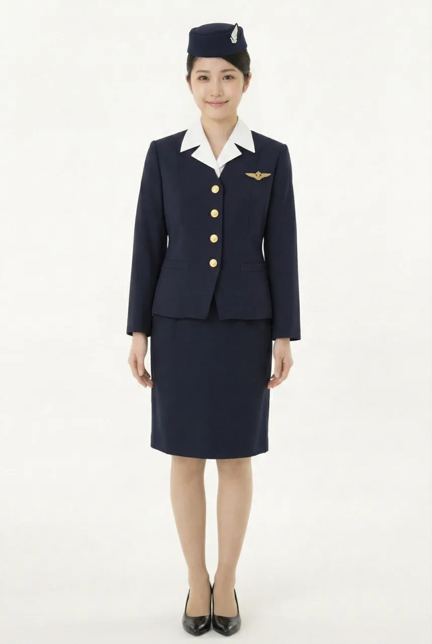
This uniform represents the third-generation cabin crew uniform introduced by Japan Airlines (JAL) in the early 1960s. It was developed alongside the introduction of Japan’s first jet airliner, the Douglas DC-8, marking JAL’s official entry into the jet age and a key milestone in the modernization of its aviation services.
The overall design adopts a clean and streamlined aesthetic, centered on a deep royal blue color scheme. This tone conveys professionalism, stability, and trust—essential qualities for the evolving image of modern air travel. The jacket features a collarless design, emphasizing simplicity and sharp lines, with four gold buttons serving as the primary visual focal point. A badge worn on the chest reinforces identity recognition while enhancing the formal appearance of the uniform.
Compared to later generations, this design is notably minimalistic. For example, the absence of chest pockets creates a more unified and uncluttered look, reflecting the period’s emphasis on modernity and functional efficiency.
The hat design also reflects the era’s stylistic evolution. Initially, it resembled a practical cap similar to those worn by milk delivery workers, simple in form and function. In December 1961, it was updated to a more fashionable turban-style headpiece, softening the overall image and introducing a more feminine aesthetic. This shift demonstrates how the uniform adapted quickly to changing tastes and branding needs.
The uniform was designed by Mohei Ito, whose approach emphasized simplicity, practicality, and modernity—perfectly aligning with the aviation industry’s transition from propeller aircraft to jet-powered travel.
Uniform List
-

First Generation No.1 Uniform (Summer Uniform)
1951 ~ 1952 -
First Generation No.2 Uniform (Winter Uniform)
1951 ~ 1954 -

First Generation No.3 Uniform (Summer Uniform)
1953 ~ 1953 -
Female flight attendant
1954 ~ 1960 -
Female flight attendant
1960 ~ 1967 -

Female flight attendant
1967 ~ 1970 -
Female flight attendant
1970 ~ 1977 -

Female flight attendant
1977 ~ 1987 -

Female flight attendant
1988 ~ 1996 -

Female flight attendant
1996 ~ 2004 -

Female flight attendant
2004 ~ 2013 -

Female flight attendant
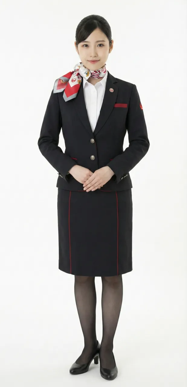
2013 ~ 2020 -
Female flight attendant
2013 ~ 2020 -

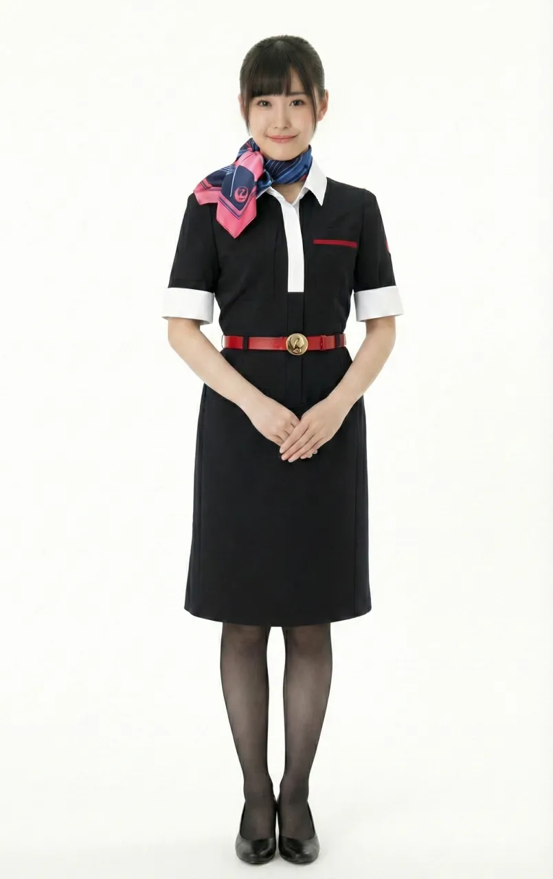
Female flight attendant
2020 ~ -
Female ground staff
2020 ~ -
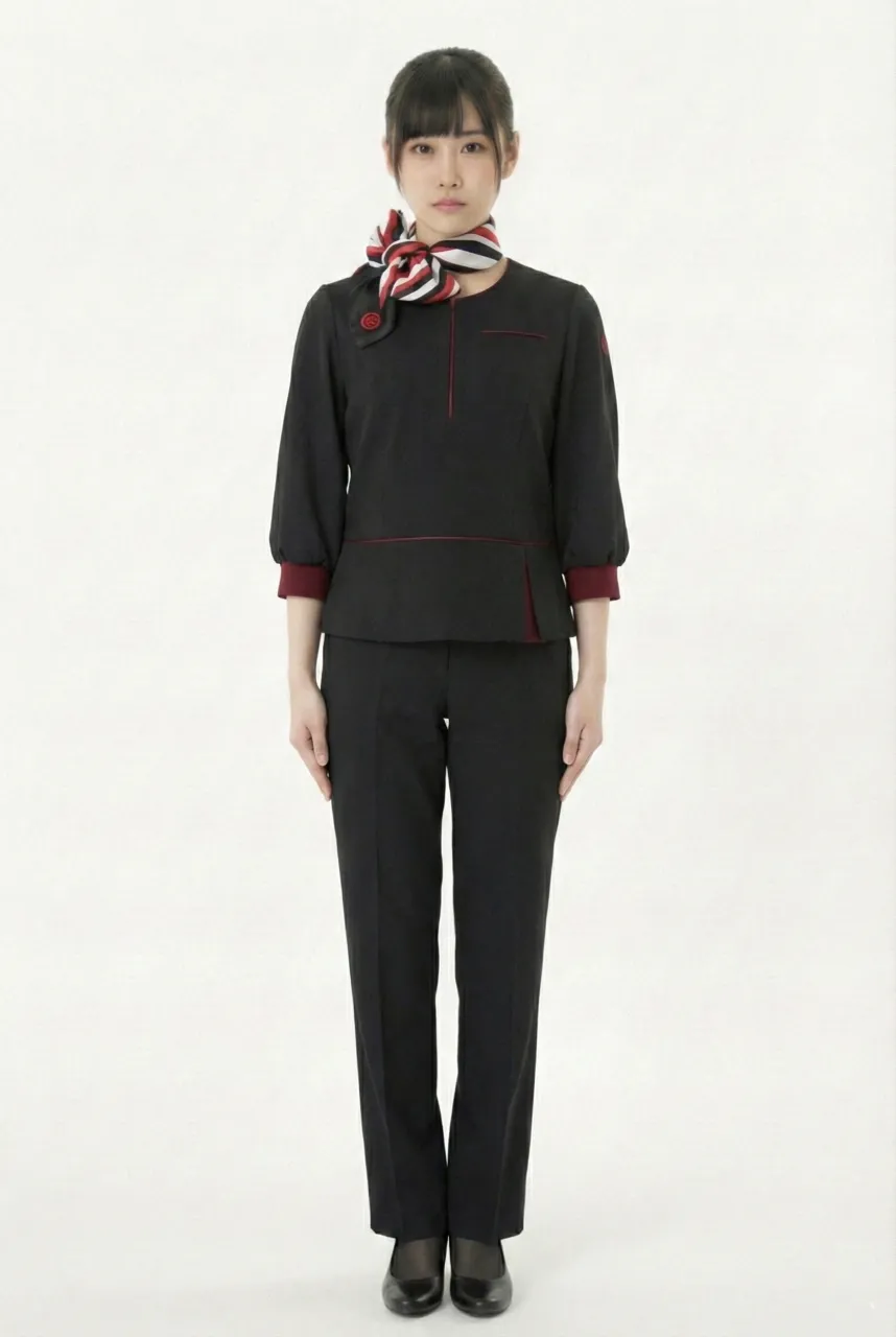
Female flight attendant in pants
2020 ~
The images displayed in this section are AI-generated illustrations and are not official materials from the original organizations or brands. They do not represent actual uniform designs, real-life wear, or official positions. The content is for informational and organizational purposes. All brand/organization names and logos mentioned are the property of their respective owners.