
Female ground staff - Japan Airlines Uniform
2020 ~
Current Uniform
Top
Bottom
Accessory
Overall
Description
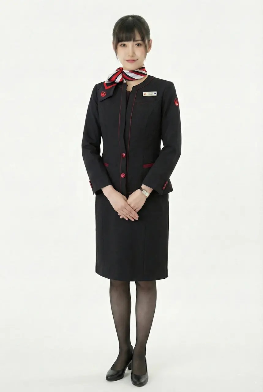
This uniform presents a very classic “urban business formal” image. The overall style is calm, sharp, and highly professional. Built primarily around dark tones and accented with subtle red details, it remains understated while still maintaining clear brand recognition. At first glance, it feels neat, orderly, and perfectly aligned with the reliable professionalism expected of ground staff or front-desk service personnel. The image is clean, well-defined, and visually timeless.
The upper half features a fitted black blazer. The shoulders are smooth and structured, and the silhouette looks crisp and upright, creating a strong formal presence when worn. The blazer adopts a standard notched lapel design, with clean and sharp lines that project the mature character of a traditional business uniform. It uses a single-breasted button layout, and the metallic buttons add refinement and subtle depth, preventing the look from feeling overly flat. The waist is naturally shaped, elongating the body proportions and enhancing the upright, professional posture expected in service roles.
In terms of details, the use of red is restrained yet highly effective. A red decorative strip appears at the chest pocket area, creating a clear horizontal accent and immediately giving the dark uniform a memorable signature. Red piping or fine lines can also be subtly seen along the blazer hem and pocket edges—details that become noticeable only when viewed up close. This design approach makes the uniform feel more premium and more specifically job-tailored, rather than simply resembling a standard business suit.
Inside, the uniform is paired with a white shirt. The clean white tone creates a fresh contrast against the dark blazer, making the overall appearance feel more alert and polished, while naturally drawing attention toward the face and upper body. The shirt collar is simple and minimal, without ruffles or decorative patterns, maintaining the structured neatness expected of a professional uniform. This keeps the image rational, composed, and fully suited to the formal requirements of a service counter environment.
Around the neck, a scarf in red, white, and grey tones is added, featuring floral or patterned elements. This scarf is the softest and most approachable component of the look. It introduces warmth into the strict black-and-white base, enhancing friendliness and service presence. The scarf is tied in a short knot and drapes to one side, preventing the look from appearing too rigid. At the same time, it reinforces brand recognition and adds a subtle elegance and feminine refinement to the uniform.
The lower half is matched with a black pencil skirt, with a length falling around the knee—an ideal proportion for formal uniforms. On both sides of the skirt, distinct red vertical lines are used as decorative accents. These lines not only echo the blazer’s red details, but also visually elongate the legs, making the overall silhouette appear slimmer and sharper. This vertical design language gives the uniform a stronger sense of energy and rhythm when standing still, and a greater visual identity while walking.
The look is completed with dark stockings and black mid-heel shoes, following standard grooming and appearance requirements in the service industry. This creates a cohesive finish and further reinforces a stable, formal presence. A name tag and insignia on the chest also increase role recognition and enhance the overall sense of professional authority.
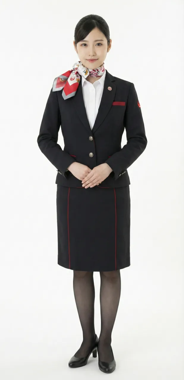
Uniform List
-

First Generation No.1 Uniform (Summer Uniform)
1951 ~ 1952 -
First Generation No.2 Uniform (Winter Uniform)
1951 ~ 1954 -

First Generation No.3 Uniform (Summer Uniform)
1953 ~ 1953 -
Female flight attendant
1954 ~ 1960 -
Female flight attendant
1960 ~ 1967 -

Female flight attendant
1967 ~ 1970 -
Female flight attendant
1970 ~ 1977 -

Female flight attendant
1977 ~ 1987 -

Female flight attendant
1988 ~ 1996 -

Female flight attendant
1996 ~ 2004 -

Female flight attendant
2004 ~ 2013 -

Female flight attendant
2013 ~ 2020 -
Female flight attendant
2013 ~ 2020 -
Female flight attendant
2020 ~ -
Female ground staff
2020 ~ -
Female flight attendant in pants
2020 ~
The images displayed in this section are AI-generated illustrations and are not official materials from the original organizations or brands. They do not represent actual uniform designs, real-life wear, or official positions. The content is for informational and organizational purposes. All brand/organization names and logos mentioned are the property of their respective owners.