
Female flight attendant in pants - Japan Airlines Uniform
2020 ~
Current Uniform
Top
Bottom
Accessory
Overall
Description
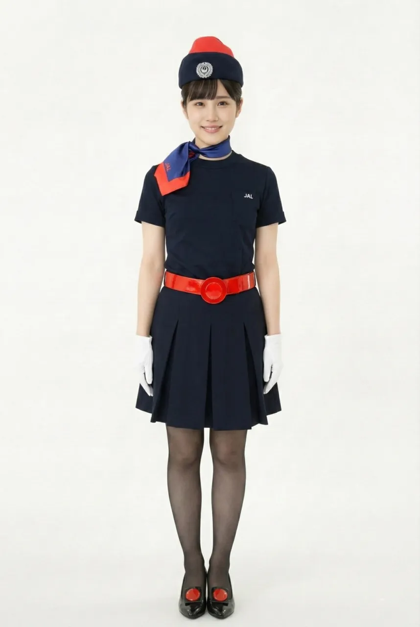
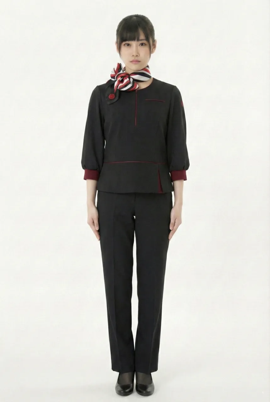
This uniform presents a highly modern, minimalist, and slightly tech-inspired “urban sharp uniform” style. The overall look is dominated by dark tones, creating a restrained and composed visual presence. At the same time, red lines and accessories are used as accents, subtly embedding the brand identity into the uniform design. The first impression is not the traditional flight-attendant uniform style that emphasizes elegant skirt silhouettes, but rather an image built around efficiency, mobility, and functional professionalism. The overall mood feels mature, calm, and clearly role-oriented.
The upper piece features a pullover-style top with no lapel design. The neckline is closer to a rounded collar or a small slit opening, which keeps the look extremely clean and sharp. This design reduces the formal structure of a blazer and replaces it with simplified lines that still communicate “uniform language,” making the top feel like a work garment that is minimalist but never casual. A subtle thin red line can be seen across the chest—like delicate stitching or fine piping—creating a focal point while adding depth and a sense of design to the dark fabric.
The cut of this top clearly reflects functional thinking. The waist area is divided by a horizontal seam line, and the hem on one side includes an asymmetric slit or overlapping detail. This adds structure and prevents the piece from looking flat or dull like a plain solid-color top. The sleeves are three-quarter length, slightly voluminous in shape, and finished with a deep-red folded cuff. This detail is especially important: it sharpens the wrist area visually while also creating a strong brand-color echo against the minimalist dark base, instantly elevating the overall refinement.
A red, white, and black scarf is styled around the neck, and it becomes one of the most noticeable identity elements of the entire uniform. The scarf features a high-contrast striped color scheme and is tied in a short knot at the side, bringing a sense of movement and energy into the otherwise calm, composed appearance. It also works strongly as a “visual guide,” drawing attention toward the face and creating a more approachable and alert service impression, preventing the look from feeling too cold or distant.
The lower half is paired with matching trousers in the same tone. The pants follow a straight-leg cut with clean lines that flatter the legs, and they are highly suitable for a job that requires long hours of standing, walking, and moving quickly. The presence of trousers gives the outfit a more neutral and sharper character, reinforcing the uniform concept of mobility, practicality, and efficiency-first design. Compared to skirts, this look feels more grounded, more functional, and more aligned with a modern standardized service system.
The shoes and stockings are kept in dark tones, maintaining a consistent and composed finish while also fitting the uniform logic of being clean, timeless, and easy to manage. Overall, the color strategy is very clear: dark tones establish professionalism, red is used through lines and cuff accents, and the red-white-black scarf serves as the key recognition element and the energetic focal point.
Uniform List
-

First Generation No.1 Uniform (Summer Uniform)
1951 ~ 1952 -
First Generation No.2 Uniform (Winter Uniform)
1951 ~ 1954 -

First Generation No.3 Uniform (Summer Uniform)
1953 ~ 1953 -
Female flight attendant
1954 ~ 1960 -
Female flight attendant
1960 ~ 1967 -

Female flight attendant
1967 ~ 1970 -
Female flight attendant
1970 ~ 1977 -

Female flight attendant
1977 ~ 1987 -

Female flight attendant
1988 ~ 1996 -

Female flight attendant
1996 ~ 2004 -

Female flight attendant
2004 ~ 2013 -

Female flight attendant
2013 ~ 2020 -
Female flight attendant
2013 ~ 2020 -
Female flight attendant
2020 ~ -
Female ground staff
2020 ~ -
Female flight attendant in pants
2020 ~
The images displayed in this section are AI-generated illustrations and are not official materials from the original organizations or brands. They do not represent actual uniform designs, real-life wear, or official positions. The content is for informational and organizational purposes. All brand/organization names and logos mentioned are the property of their respective owners.